Credit usage
Credit-based plans only
This article is only relevant if you are on a credit based (pay-by-minute) subscription plan. Users who aren’t on a credit based plan don’t see the Credits page on Insights.
Keeping an eye on your credit usage can help to avoid surprises caused by changes which result in increased credit usage. Using Bitrise Insights you can see your credit usage trends and if you notice any negative trend you can use Insights to track down what is causing that.
Tracking overall credit usage
When you open Bitrise Insights you start on the Overview page.
Scroll down to the Credit usage section to see your Workspace’s overall credit usage and the top 5 apps using the most amount of credits.
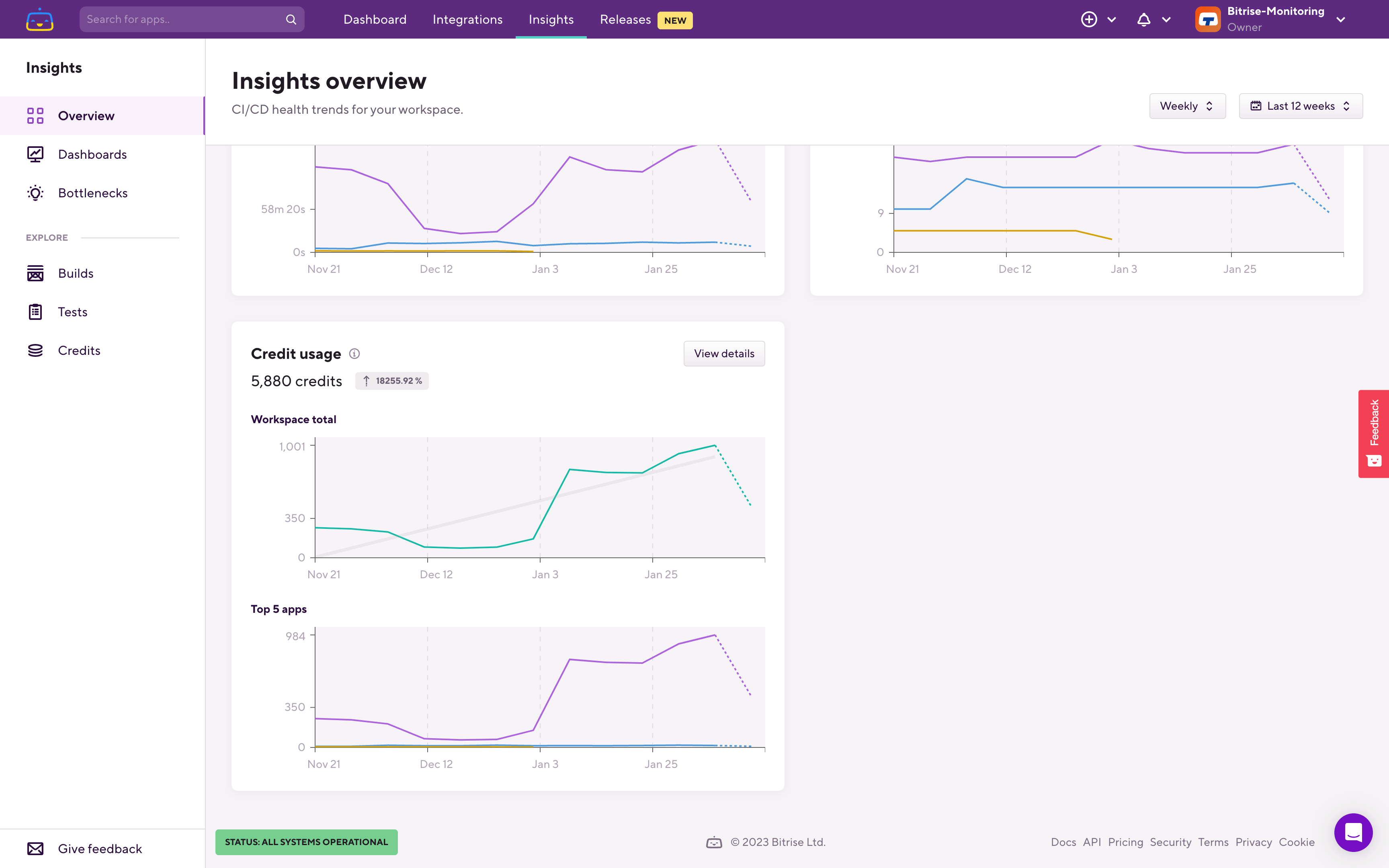
If you want to predict your credit usage switch over to the Credits page, either by clicking the Credits option under the EXPLORE section in the left sidebar, or click the View details button in the Credit usage section.
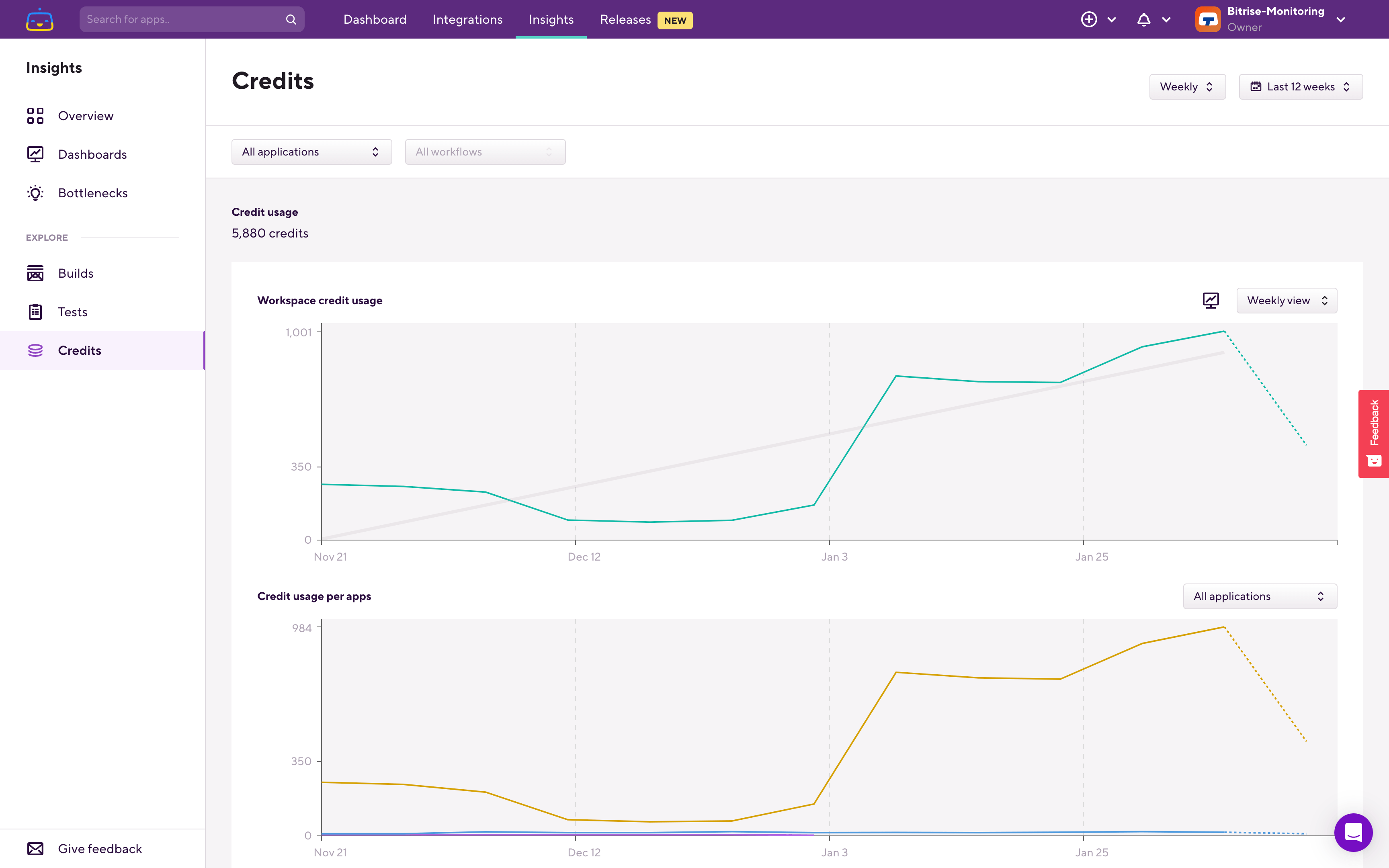
On the Credits page by default you’ll see your last 12 weeks (3 months) credit usage trend on a week-by-week basis.To predict how much credits you’ll use you have a few options.
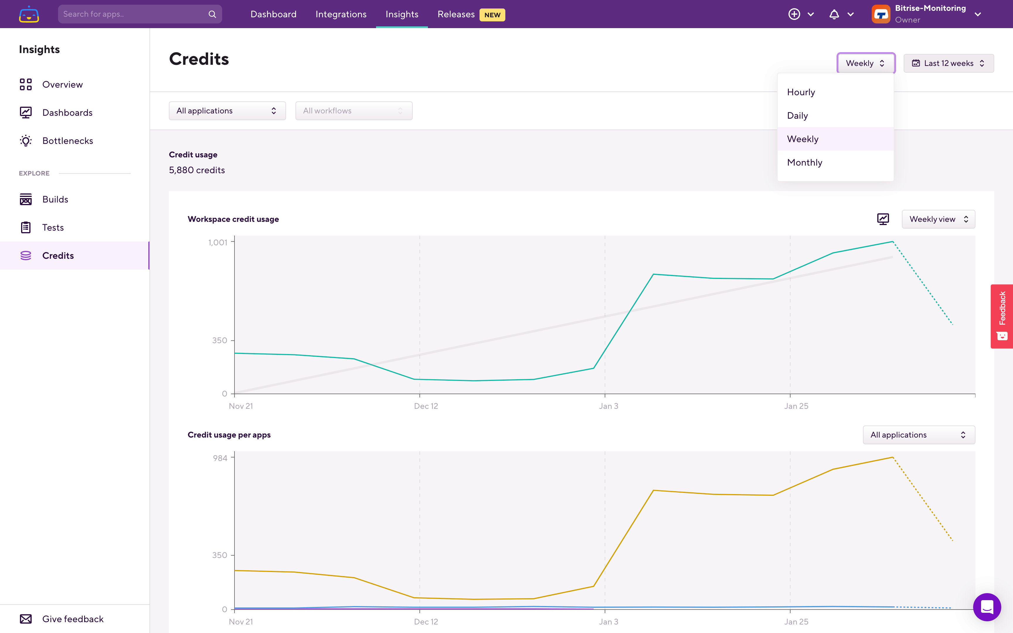
Switch to monthly view to see your last 6 months credit usage, the trend of your credit usage, and the current month’s usage so far.
Alternatively you can also switch to daily view (Last 30 days) and change the chart to Cumulative to see how much credit you used in the last 30 days and the trend of it:
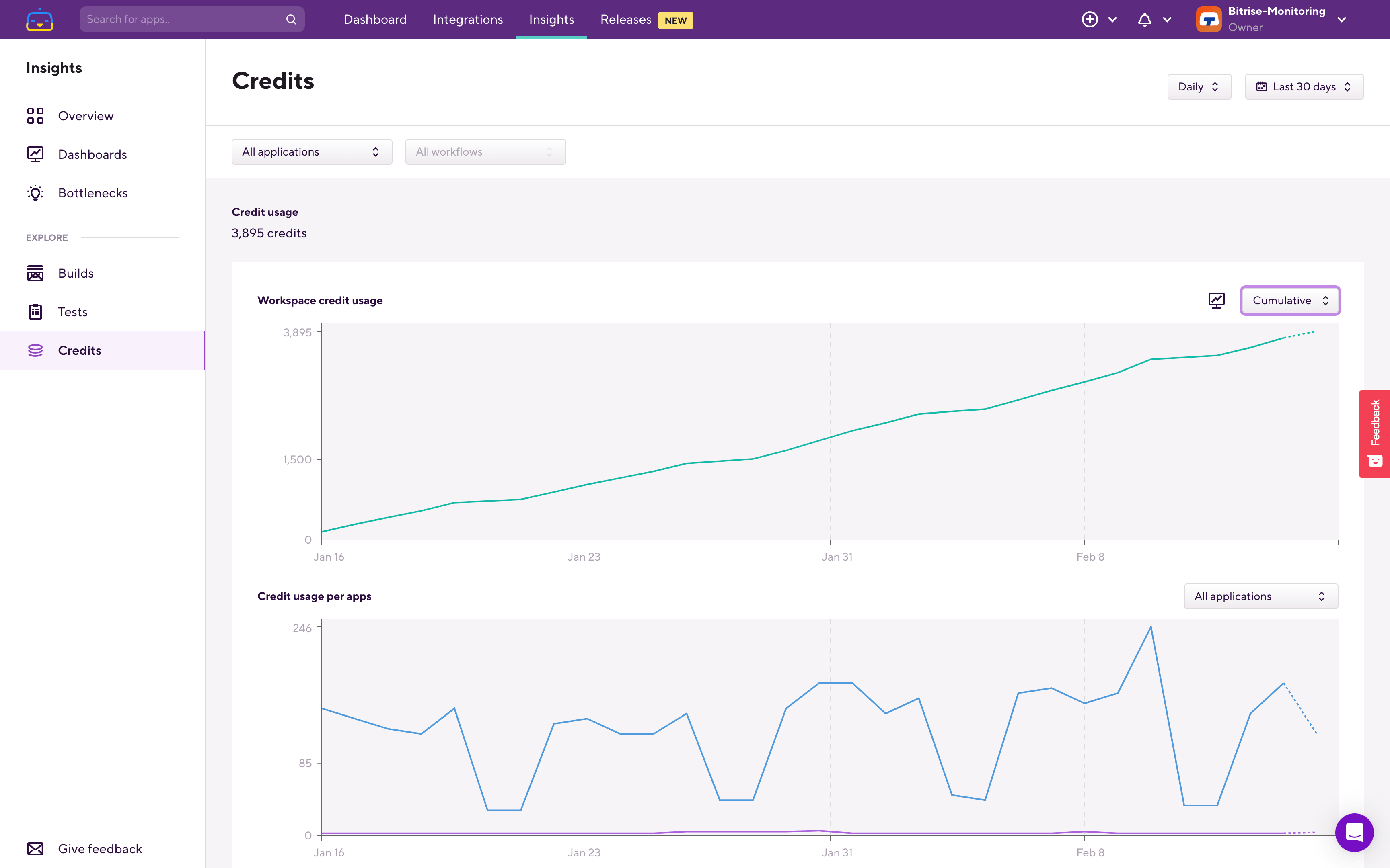
If the trend is fairly stable (no large jumps and drops) then most likely you’ll use about the same amount of credits than what you did in the last 30 days, which you can see in the upper left corner under Credit usage.
Comparing this daily to the monthly view should give you a good guidance about how much credit usage you should expect in the month and how that compares to your previous months' credit usage.
Credit usage by app, Workflow or Step
Open the Credits page under the EXPLORE section in the left sidebar. You can also switch to weekly view, to the last 12 weeks, if you’re not already in weekly view:
Just like on any other Explore pages you’ll see two charts. The upper chart always shows you data for the filters you set. The lower chart is called the breakdown chart and it shows you data one level deeper than what you filtered on.
If you have only a single app in your Workspace then Insights will automatically select that app when you open any of the Explore pages. If you have multiple apps in your Workspace, when you open the Credits page the upper chart shows you the overall credit use of the Workspace across all of your apps in the Workspace.
The lower chart in this case shows you the same data but on a per app basis. From this you can see which app used the most amount of credits in the selected time period.
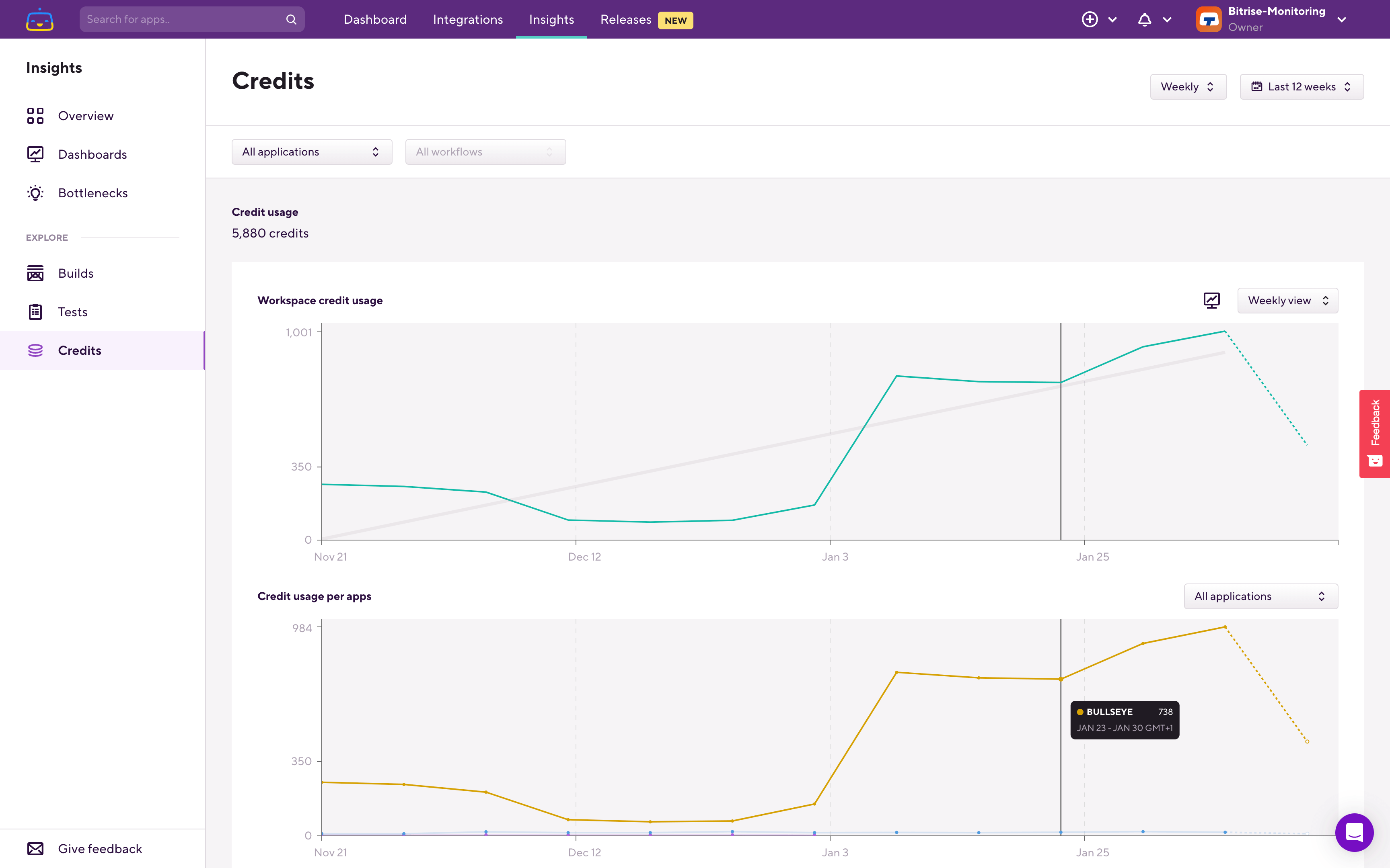
Here on the breakdown chart you can see that we have this application which used the most amount of credits in this Workspace. Filter down to that app, and on the next level you'll find the per Workflow breakdown.
The upper chart now shows what is filtered on, so in this case it's the selected app's credit usage. On the lower, breakdown chart you can see which is the Workflow which used the most credits.
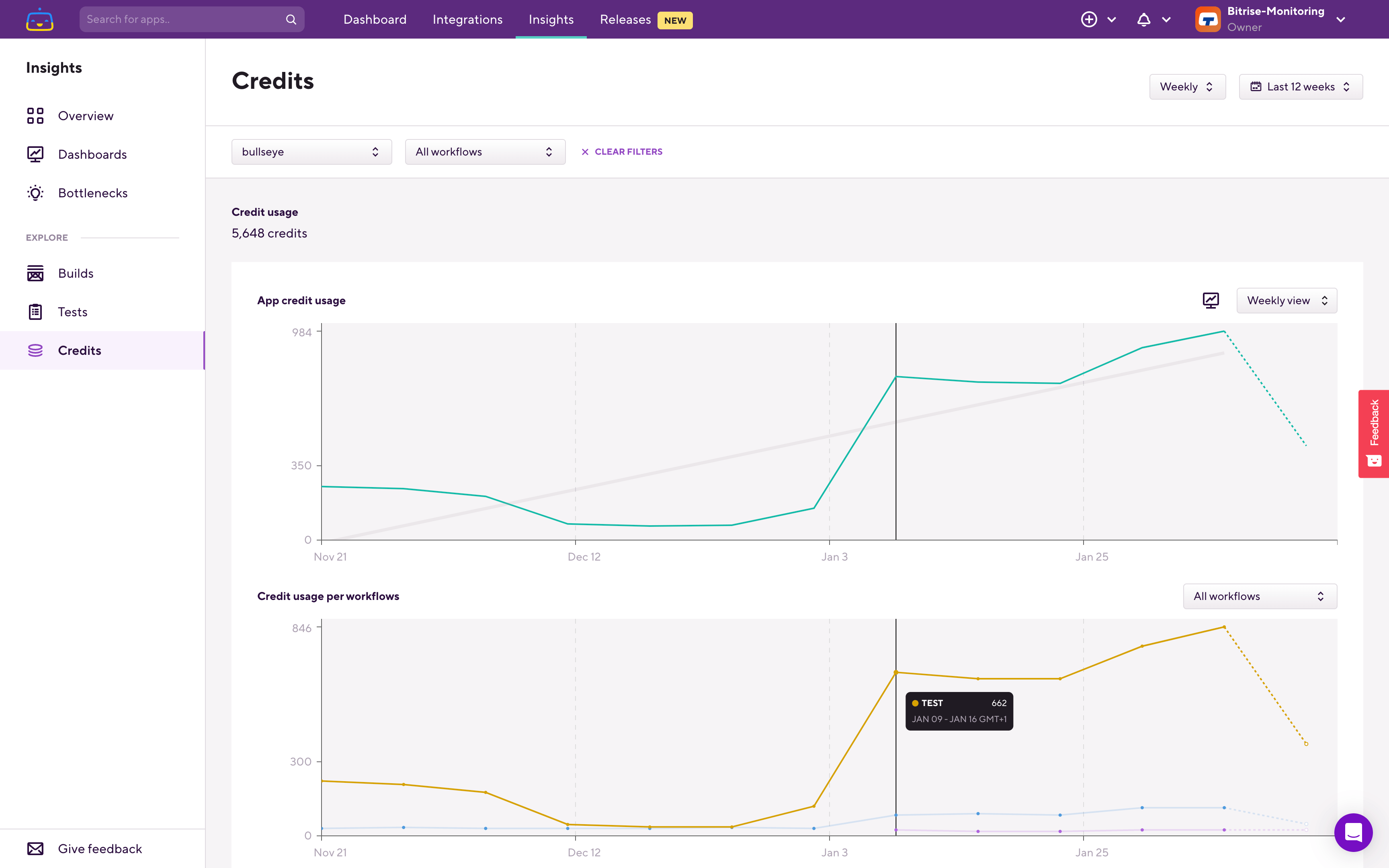
Let's filter down to that Workflow.
The chart now reflects this filtering and shows the credit usage trend of the Workflow.
From here we should find out what is causing this credit usage increase in this Workflow. This might be caused by slower builds, increased amount of builds, or by changing the machine type to one which uses more credits per minute.
To investigate this switch over to the Builds page. When you switch to any other Explore pages the filters you previously selected will carry over, so you won’t have to select the same app and Workflow again.In this case going through the metric tabs most metrics seem stable during this period, but we can see a similar pattern on the Total duration metric:
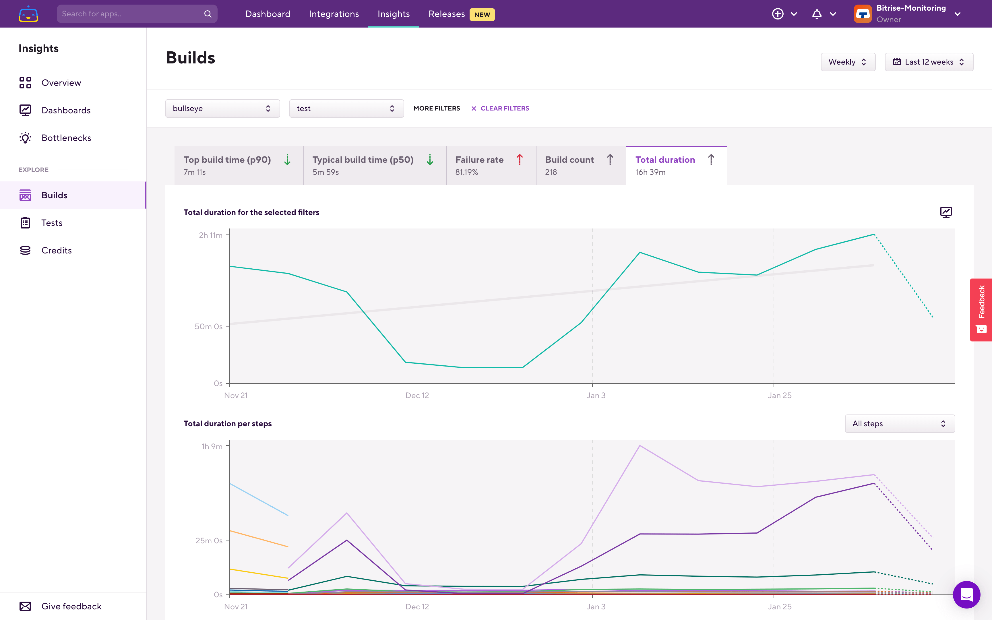
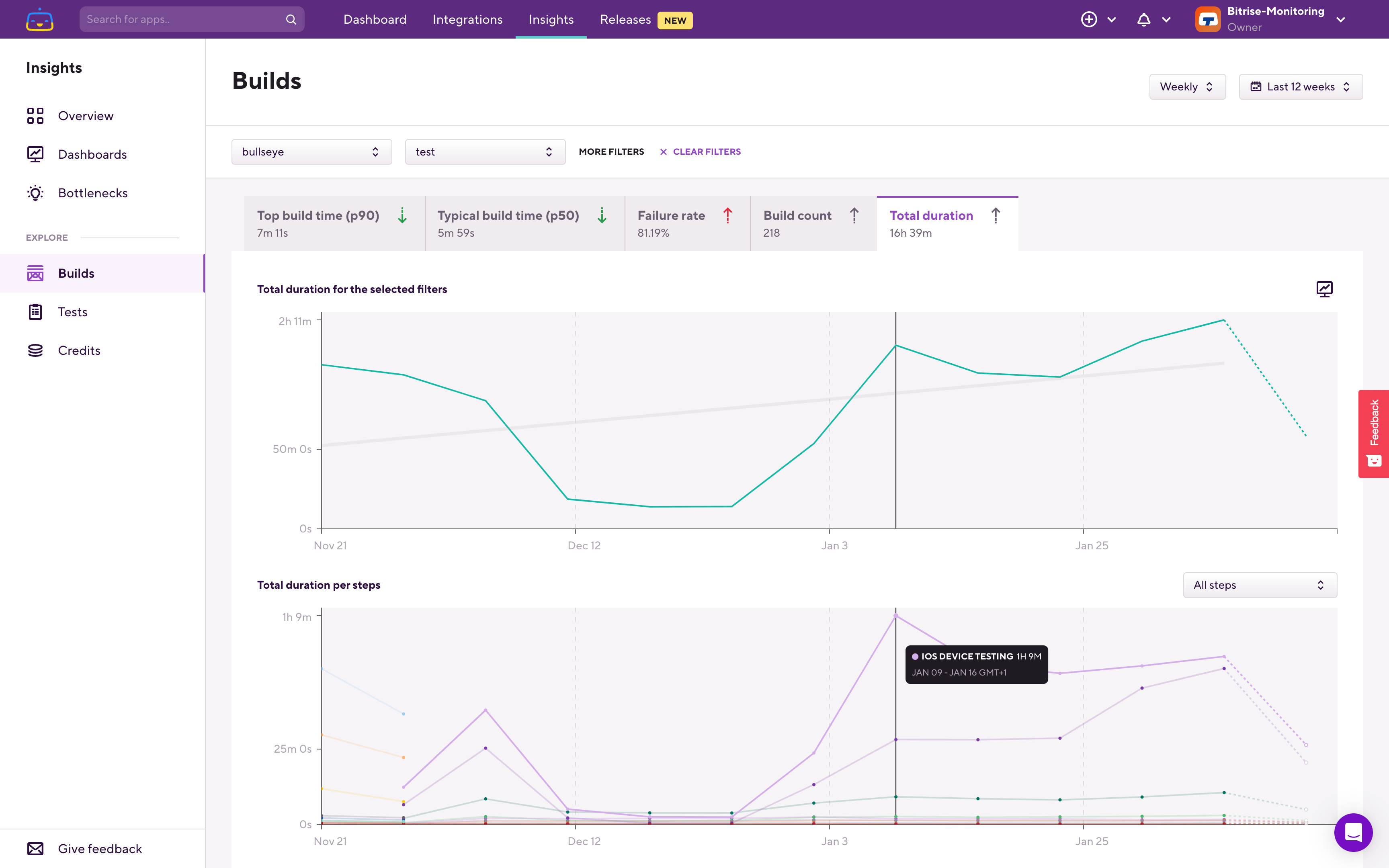
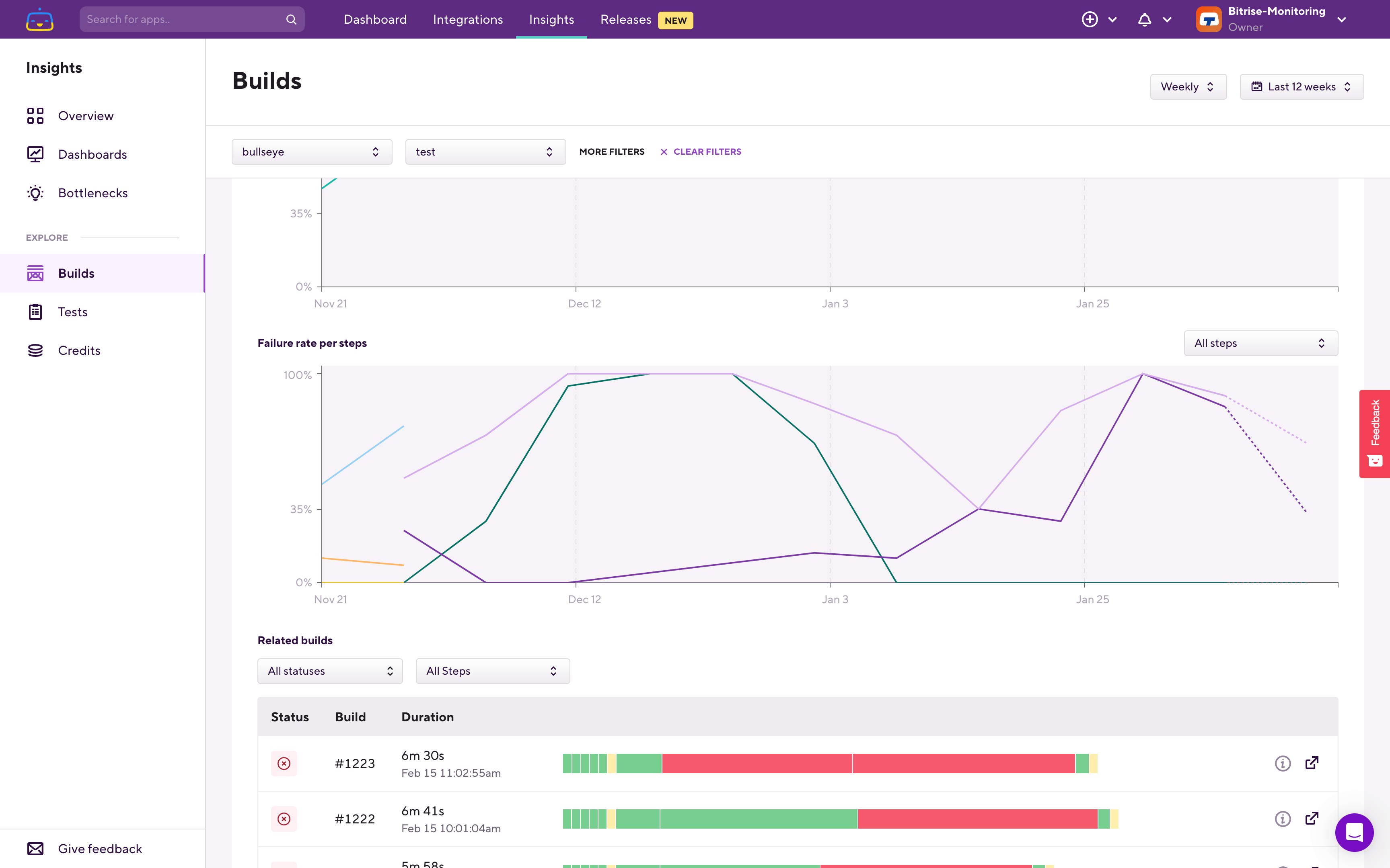
Similar to the Credits page, the Builds page also has 2 charts on it. The top one shows the selected metric (Total duration in this case) for the relevant filters (for the selected app and Workflow).
The lower breakdown chart shows the per step distribution of the total build duration. From this we can see that the iOS Device Testing Step took the most amount of time and it also correlates with the overall trend.
As build times and build count was consistent for the whole 12 weeks, and the only other metric which had a change during this period was Failure rate, let’s switch over to that tab:
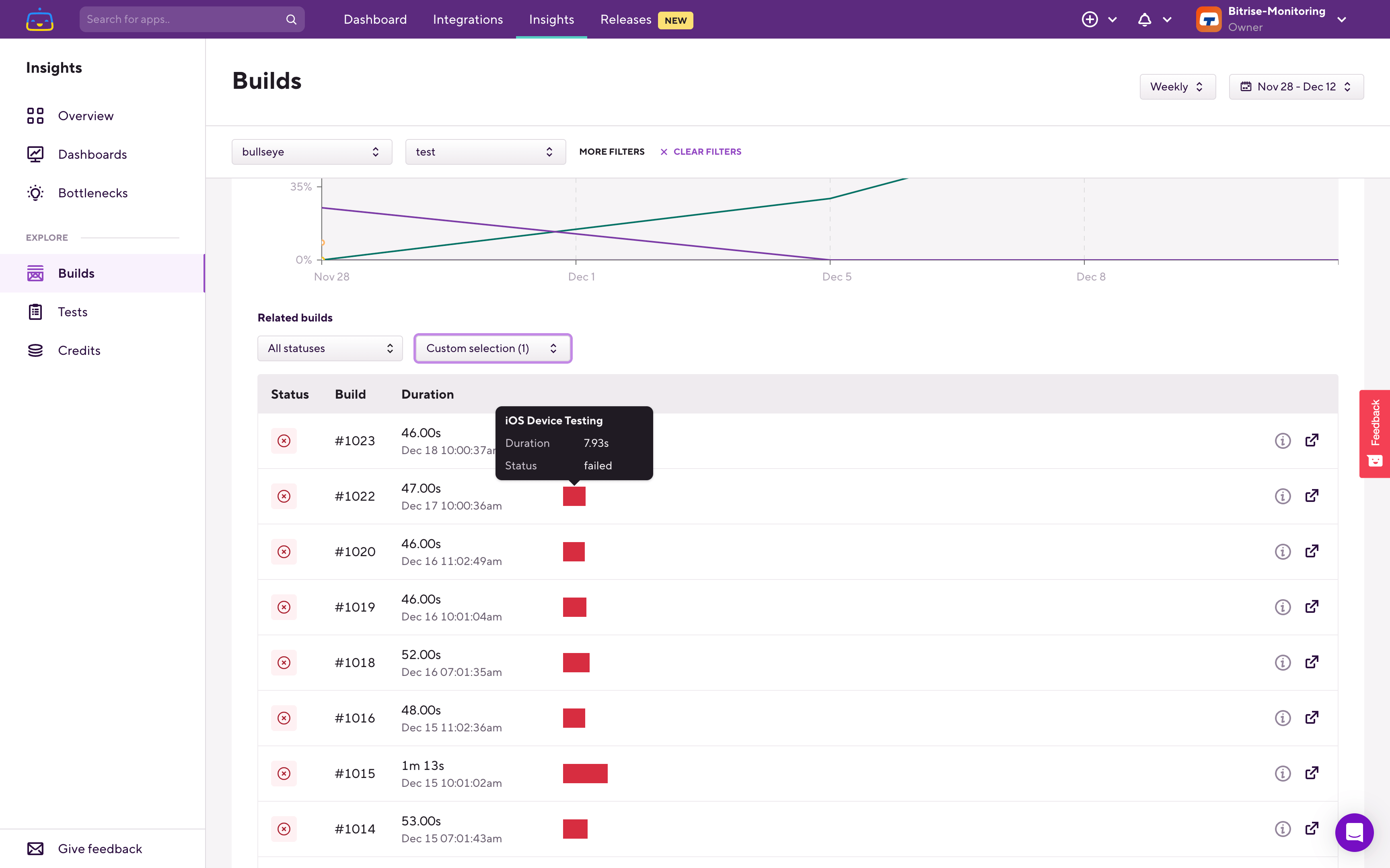
What we can see here is that where we had the drop in credit usage as well as in total duration the iOS Device Testing Step had a 100% failure rate. As failed Steps usually take less time to finish, let’s check the related builds as well in the Related builds section under the charts.
To find the relevant builds we’ll zoom into the period where failure rate increased. The easiest way is to click-hold-and-drag on the chart.
Let’s filter down to just this single Step as well in the Related builds section:
Now we can scroll through the build history and see how the build time of this Step changed. At the end of the period, where the failure rate was 100% we can see that it only took a few seconds:
As we keep scrolling we can see that back in early December where we still had successful builds the Step took multiple minutes to complete:
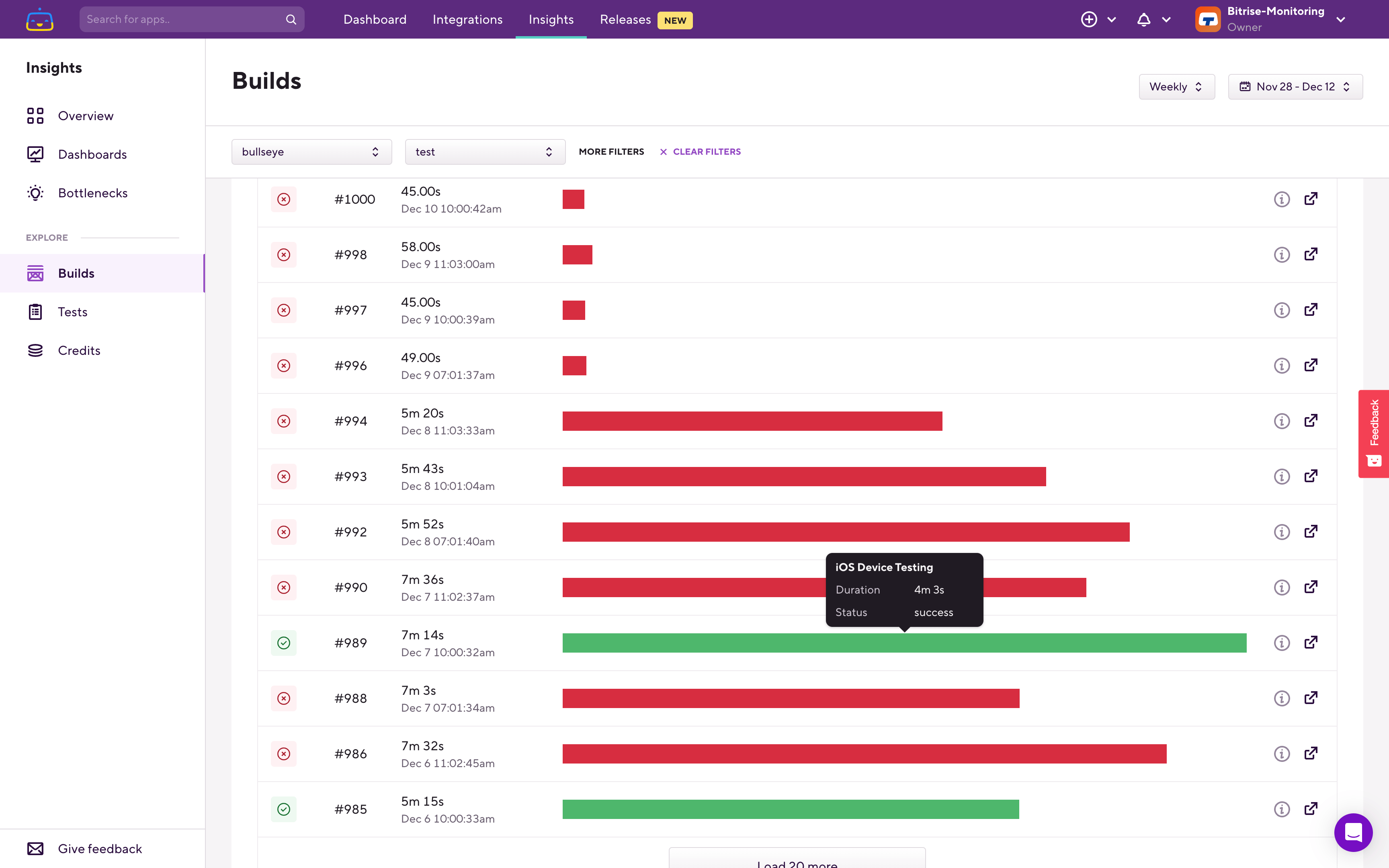
So in this case the drop on the total duration (and in credits) was caused by this Step failing a lot, which meant that builds completed quicker, until the issue with the tests was fixed, when the Step and the builds once again took longer to finish, but could actually run and finish the tests.
Another place which worth to be checked periodically is the Bottlenecks page:
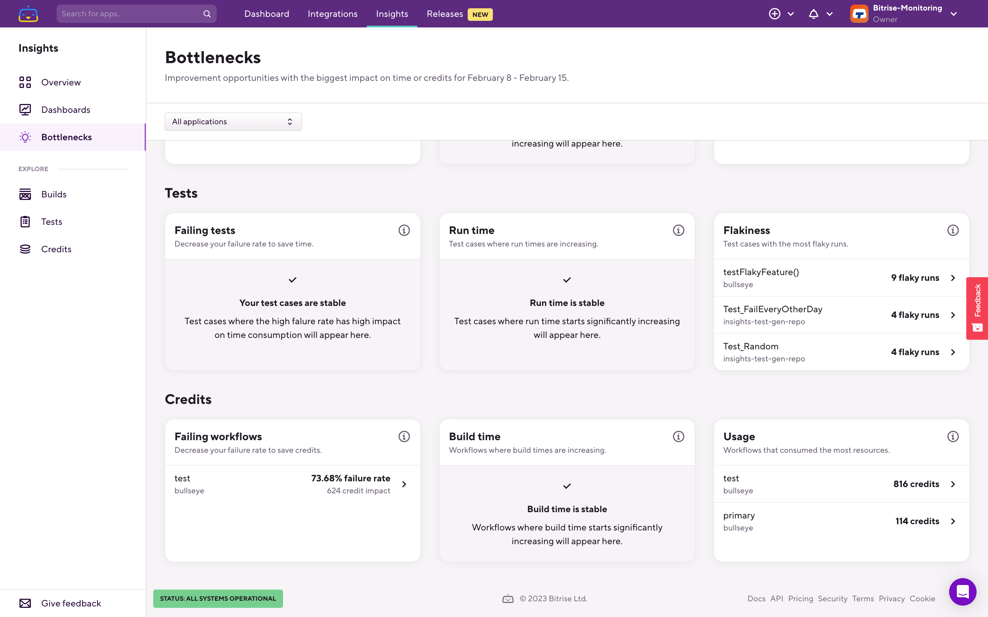
On this page you can find a Credits section where Bitrise Insights highlights you negative trends which consumed the most amount of credits.
Failing Workflows shows you Workflows which had a lot of credit usage on failed builds. On the example above you can see that the Workflow called test failed in 73.68% of the cases in the last 7 days and those failed builds consumed 624 credits in total.
Build time shows slowing build trends, where the build took longer in the last 7 days than in the 7 days before that, and tells you the credit impact of that negative trend.
The Usage bottleneck simply lists you the Workflows which used the most amount of credits in the last 7 days.
Clicking any of these bottleneck items will open the relevant Explore page filtered down to the Workflow.