Tracking build failure rate
For every failed build, you’ll most likely have to 1) spend time to fix the failure, 2) then try the build again, and 3) then wait for the retried build to finish. Even if you can switch to do something else while the build is running there will be a context switch when you have to switch back once the build is done.
If your build failure rate is high on a specific app’s or Workflow’s builds, that means people frequently spend time on debugging, fixing and then retrying builds.
Failure rate is especially crucial for long builds, as the engineers will have to wait even more when they do a fix and then run a new build. Tracking and reducing the frequency of failed builds can help minimizing the time and effort spent on resolving build failures and increase the overall efficiency and productivity of your team.
The main goal is to reduce the wait time throughout the development process. If you have builds which fail frequently that means that sooner rather than later you’ll have a failing build, where you’ll have to check why it failed, fix the issue, and then try it again and wait for the build to hopefully pass. As part of this you’ll likely lose time either because of context switching or because you can’t do anything useful while you’re waiting for the results of that build.
Finding frequently failing builds
When you open Bitrise Insights, you can find the Build failure rate chart on the Overview page.
Here you can see your overall build failure rate trend in the whole Workspace and you can also see the top 5 most frequently failing apps' build failure rate trends.
From here you can continue your investigation using either the View details button or by clicking the Builds page under the EXPLORE section in the left sidebar.
After you open the Builds page switch to the Failure rate tab.
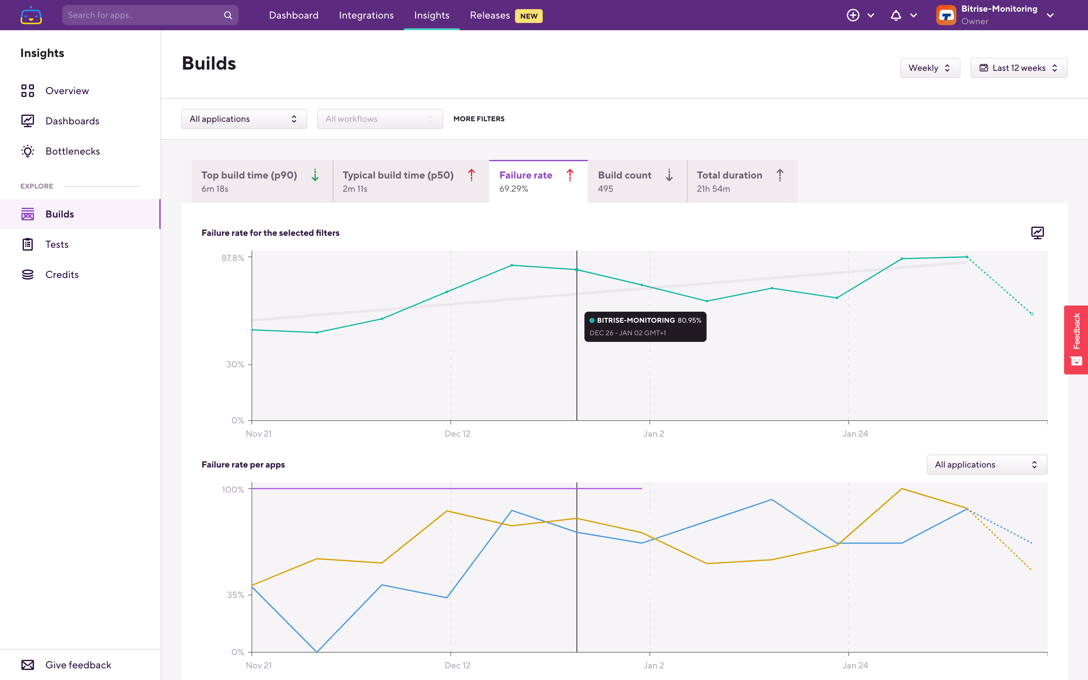
On the Builds page, depending on which filters are applied, you can start from the Workspace level which you can see on the upper chart. Using the intelligent breakdown (the 2nd, lower chart) you can drill into the data to find which application, which workflow, which step is causing the build failure rate trend that you are checking.
Let's go through an example. Here on the breakdown chart you can see that we have this application which is failing most frequently in this Workspace:
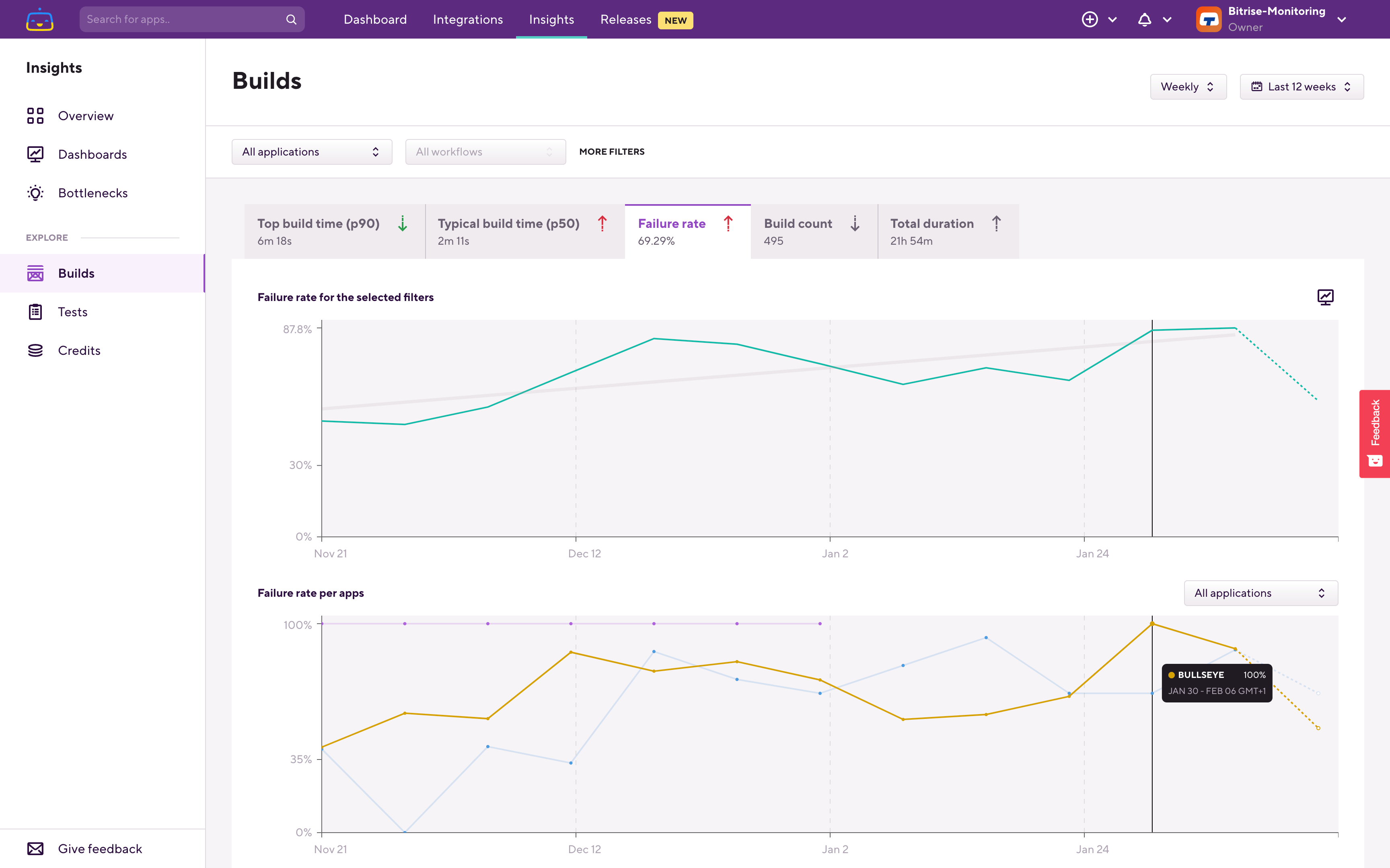
Filter down to that application, and on the next level you'll find the per Workflow breakdown.
The upper chart now shows what is filtered on, so in this case it's the selected app's failure rate. On the lower, breakdown chart you can see which is the Workflow which fails most frequently.
Let's filter down to that Workflow:
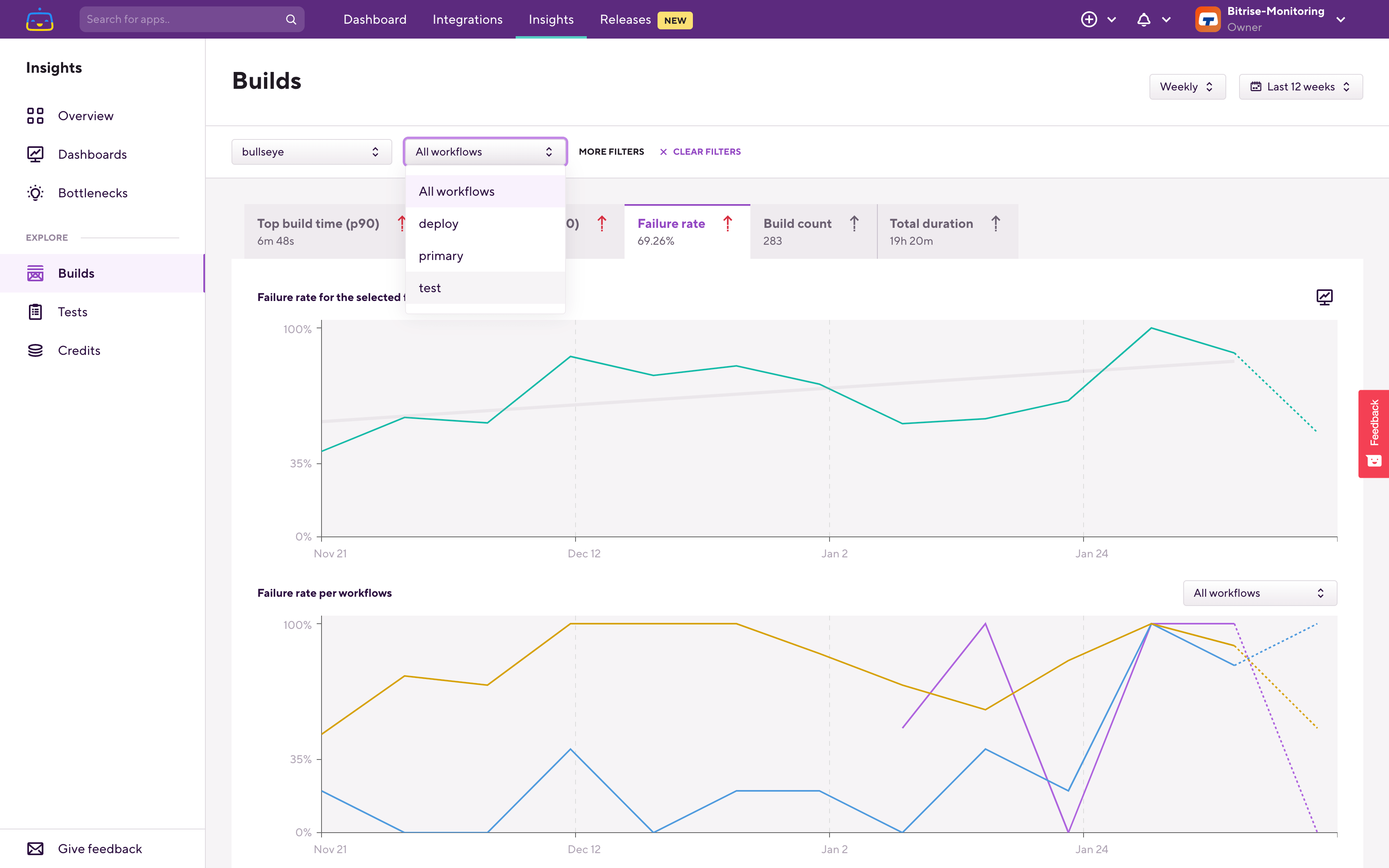
The upper chart now reflects this filtering, and the breakdown chart switched over to per Step failure rate. Using the breakdown chart you can find out which Step is causing the failure rate trend that we are investigating.
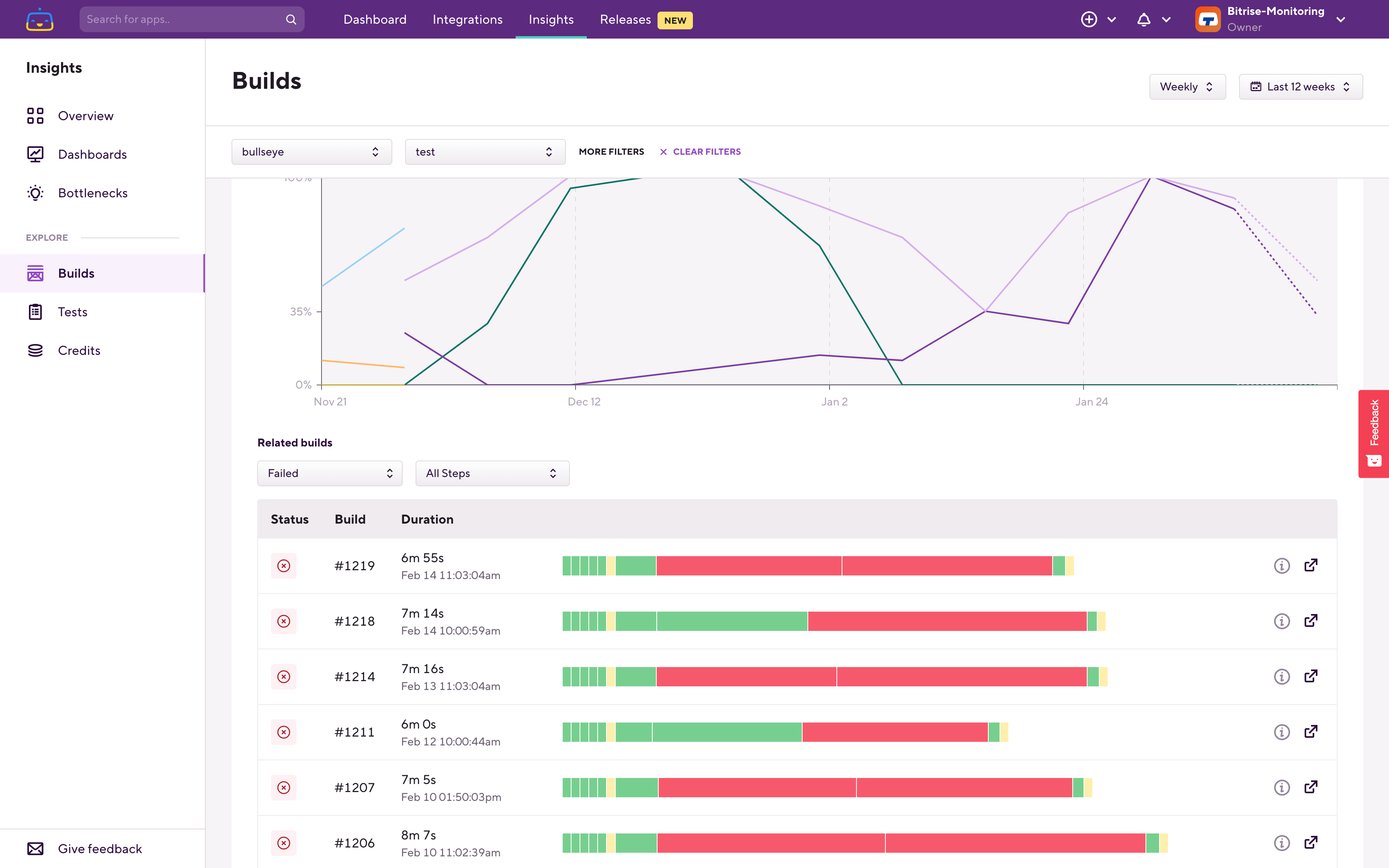
Under the graphs you can also see the build history which is filtered based on the filters that you set at the top and also on the time range that you set in the top right corner.
Hovering on the bars you can see how long specific Steps took and in which build that step failed.
When you find the builds which correlate with the trend that you're checking then you can quickly jump to the relevant build's page and then continue your investigation there.
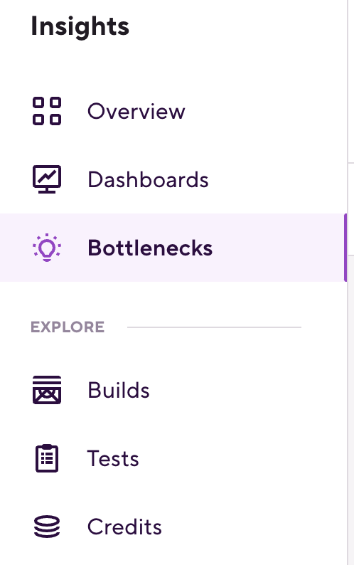
Diagnosing bottlenecks causing builds to fail
There’s another page that is worth checking periodically in Insights: the Bottlenecks page:
On the Bottlenecks page Insights shows you negative trends from the last 7 days. The relevant bottleneck is the Failing Workflows one, which lists Workflows which consumed the most amount of time to fail. It lists the Workflows based on the time impact of the failing builds.
This is usually a good place to check as the time impact calculation here reflects both how frequently the builds of a given Workflow fail as well as how long those failing builds take. The time impact listed on this page is the total amount build time of the failing builds for that Workflow in the last 7 days. In the example above it means that the bullseye app’s test Workflow builds failed in 73.68% of the cases, and in total those failed builds consumed 1 hour and 38 minutes in the last 7 days.
By listing the Workflows based on time impact instead of based on just the failure rate, the Bottlenecks page helps you to focus on the most impactful build failure trends. As an example, if you have a Workflow which had only a few builds and those all failed, while another Workflow had tens or hundreds of builds and it failed in 50% of the cases, if both Workflows builds are about the same length the second Workflow will be ranked higher, as overall those failed builds caused more wait time for engineers.
Keeping an eye on and improving your build failure rate helps you to reduce wait time during the app development process and to increase the efficiency and productivity of your team.