Tracking test failure rate
When your mobile app’s tests fail in a continuous integration (CI) environment, it typically indicates that the build has also failed. This means that someone will need to make code changes or fixes and then retry the build and test it again, leading to a cycle of iterations. Even if someone switches to other tasks while the test and build are running, there will be a context switch when they have to return to the task once the test and build are done.
The importance of test failure rate
A high mobile app test failure rate suggests that people frequently spend time debugging, fixing, and then retrying — and waiting for — tests and builds. Failure rate is especially critical for long tests and builds as engineers will have to wait even more when they do a fix and then run a new build and test.
By tracking and analyzing where and why your mobile app’s tests fail the most, teams can improve their testing process and make it more resilient over time. Meaning, the time and effort spent on resolving test failures are minimized and the overall efficiency and productivity of your team are increased.
The main goal of tracking your mobile app’s failing tests is to reduce the wait time throughout the development process. If you have tests that fail frequently, it means that sooner or later you’ll have to wait for that test and the related build, fix the issue, and then try it again. As part of this cyclical process, you’ll likely lose time either due to 1) context switching or, 2) because you can’t do anything useful while you’re waiting for the results of that test and build.
Finding frequently failing tests
When you open Bitrise Insights, you can start with the Build failure rate chart on the Overview page to find the most frequently failing apps and builds. If you’re only interested in tests, you can switch to the Tests page under the EXPLORE section in the left sidebar.
After you open the Tests page, switch to the Failure rate tab.
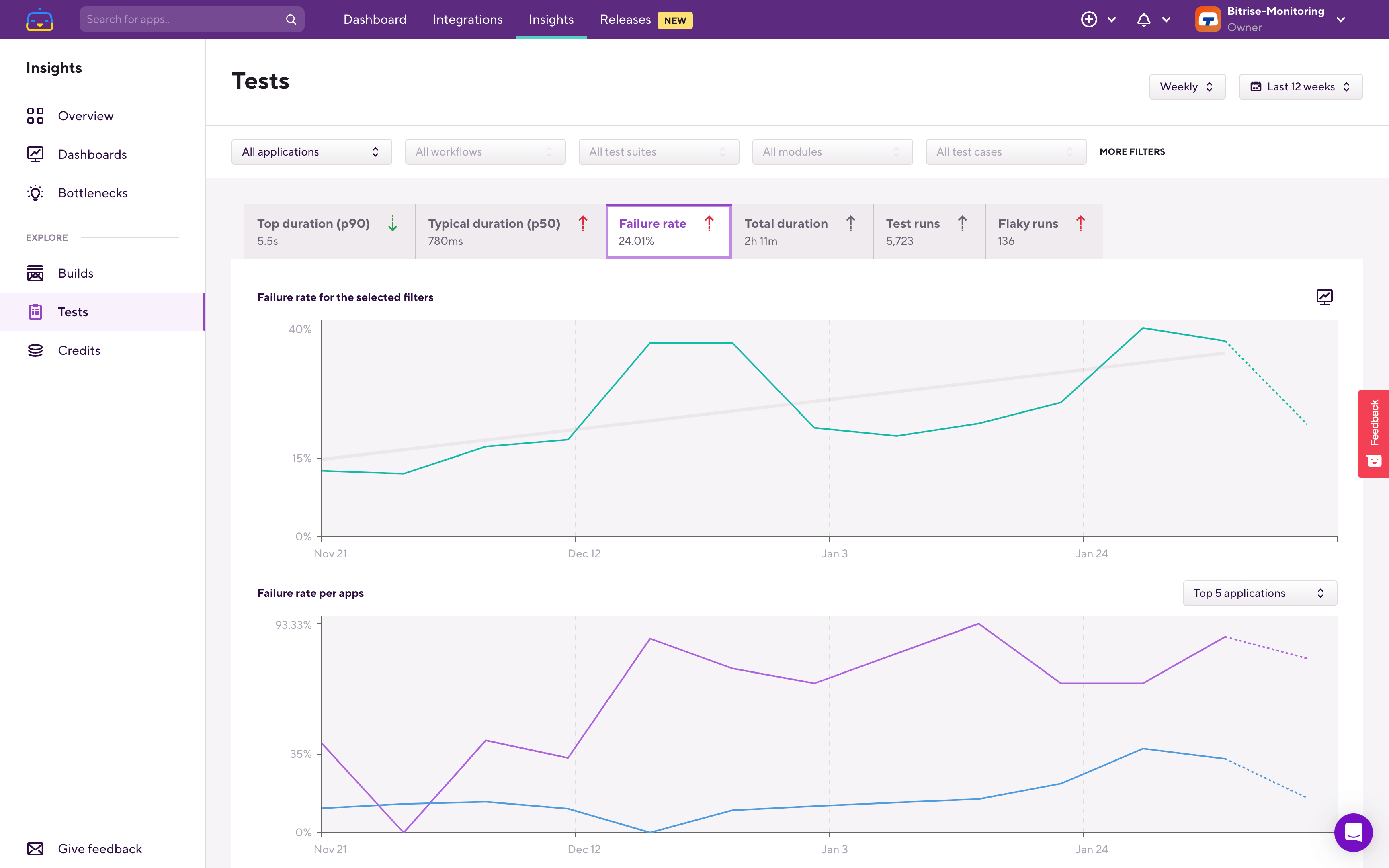
On all of the Tests metric pages. you’ll see two charts. The upper chart always shows you data for the filters you set. The lower chart is called the breakdown chart and it shows data one level deeper than what you filtered on.
If you have only a single app in your Workspace then Insights will automatically select that app when you open any of the Explore pages. However, if you have multiple apps in your Workspace, when you open the Tests page the upper chart it will show you the overall test failure rate of the Workspace — based on test suite failure rates in all of your apps in the workspace.The lower chart, in this example, shows you the same data — but on a per-application basis. From this you can see which app’s test suites are failing the most.
Here’s a working example. On the breakdown chart, you can see the application that has the most frequently failing test suites in the Workspace. When filtering down into that app, you'll find the per test suite breakdown:
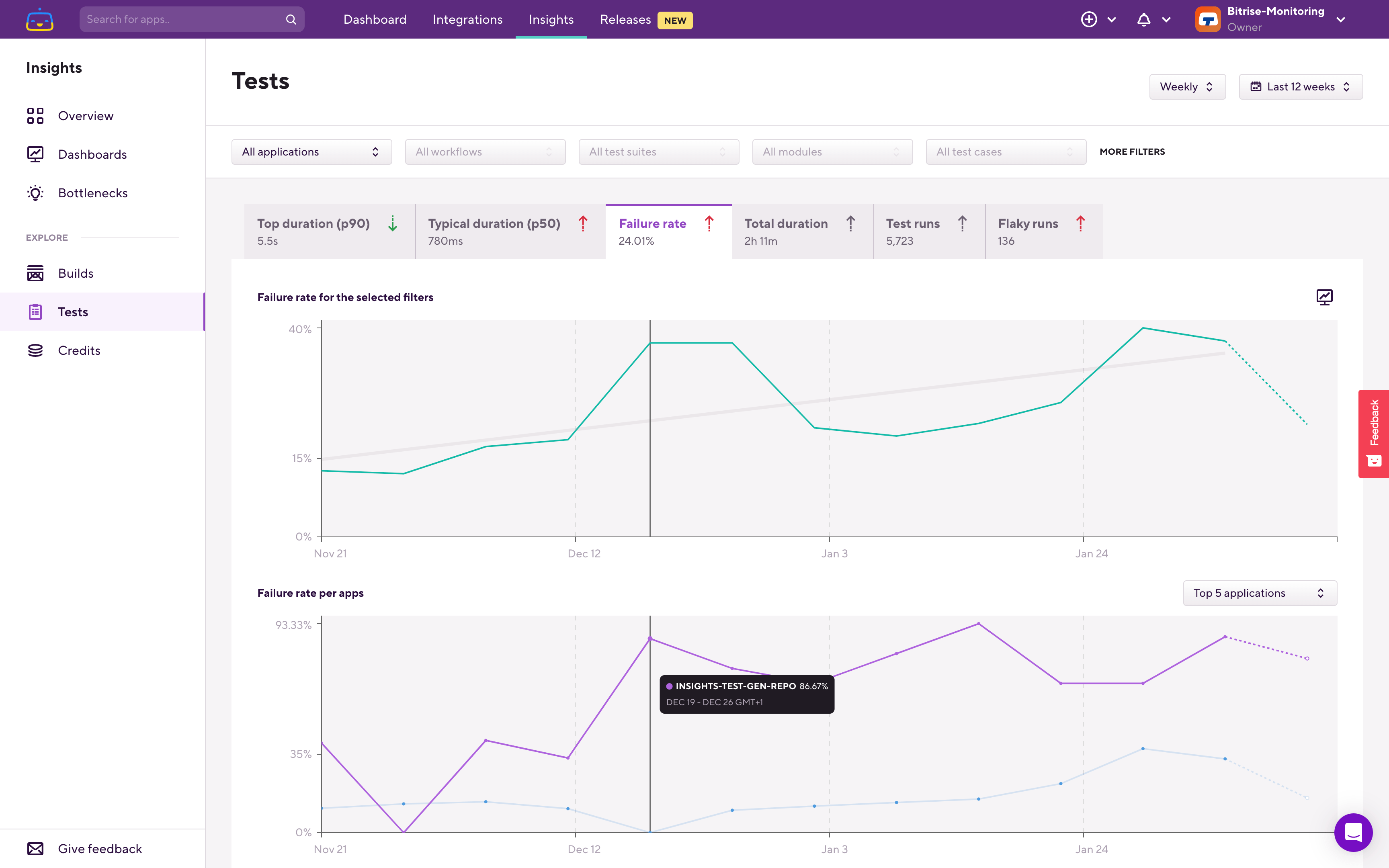
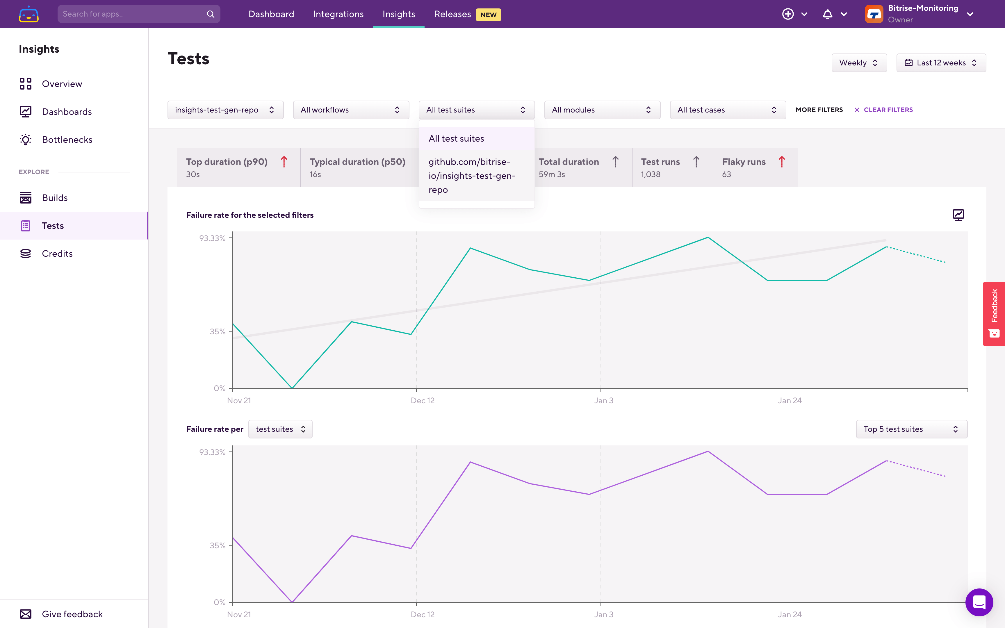
The upper chart now shows what is filtered — so in this case, the selected app's test suite failure rate is being displayed. On the lower, breakdown chart, you can see which test suite failed most frequently.
Let's filter down to that test suite.
The upper chart now reflects this filtering, and the breakdown chart switched over to per branch failure rate. Under the graphs, you can see the Test cases list, which is filtered based on the filters that you set at the top and also on the time range that you set in the top right corner.
Using this Test cases table, you can find which test case is failing most frequently (Failure rate) or which test case failed the most amount of times (Failure count) in the selected time period, app, and test suite.
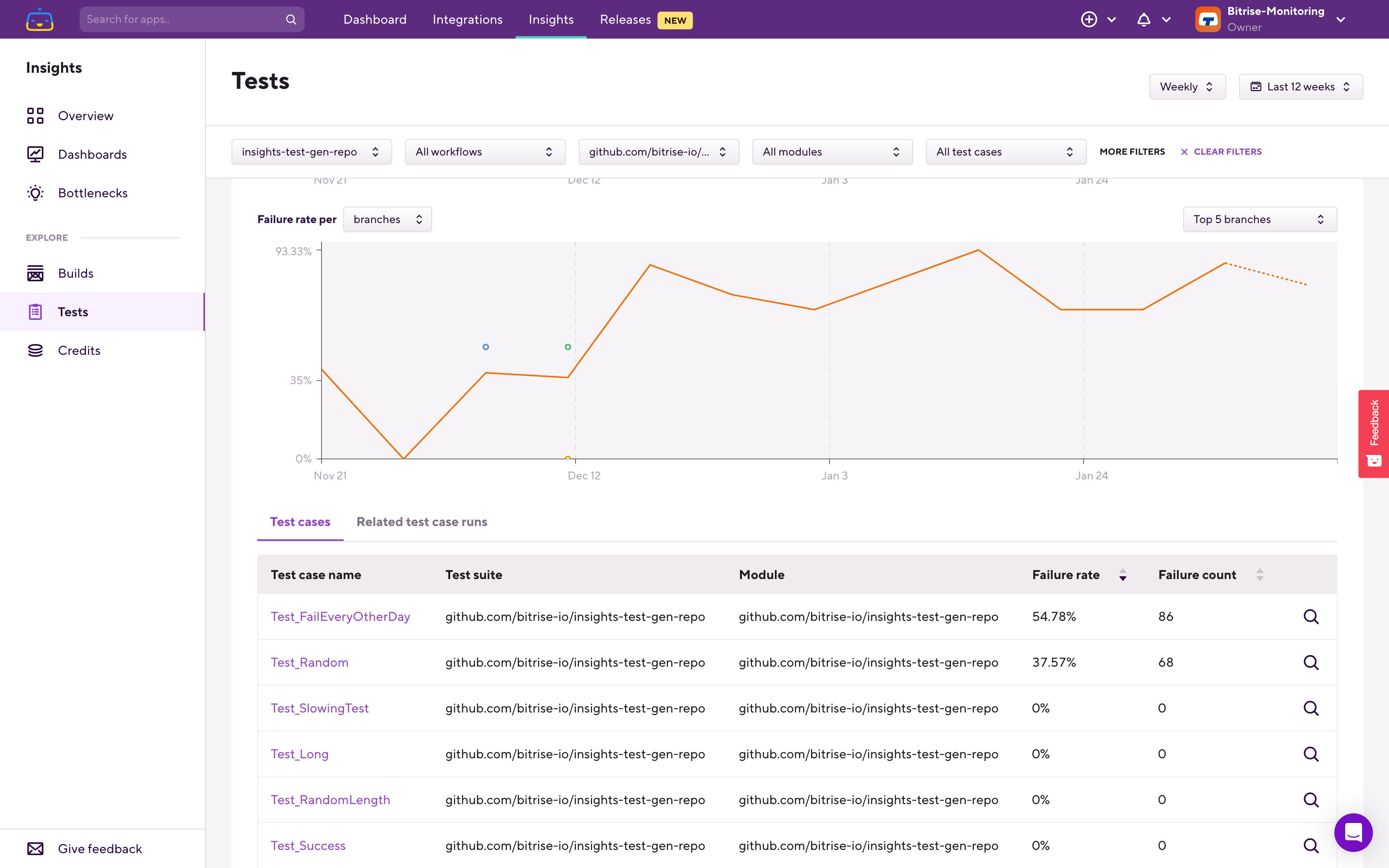
Select the most frequently failing test case to continue your investigation.
This will set the relevant filters for you to focus only on this specific test case. As a result, the charts at the top will now only show the failure rate trend of this specific test case.
Under the charts, the Insights filter automatically switched over to the Related test case runs tab:
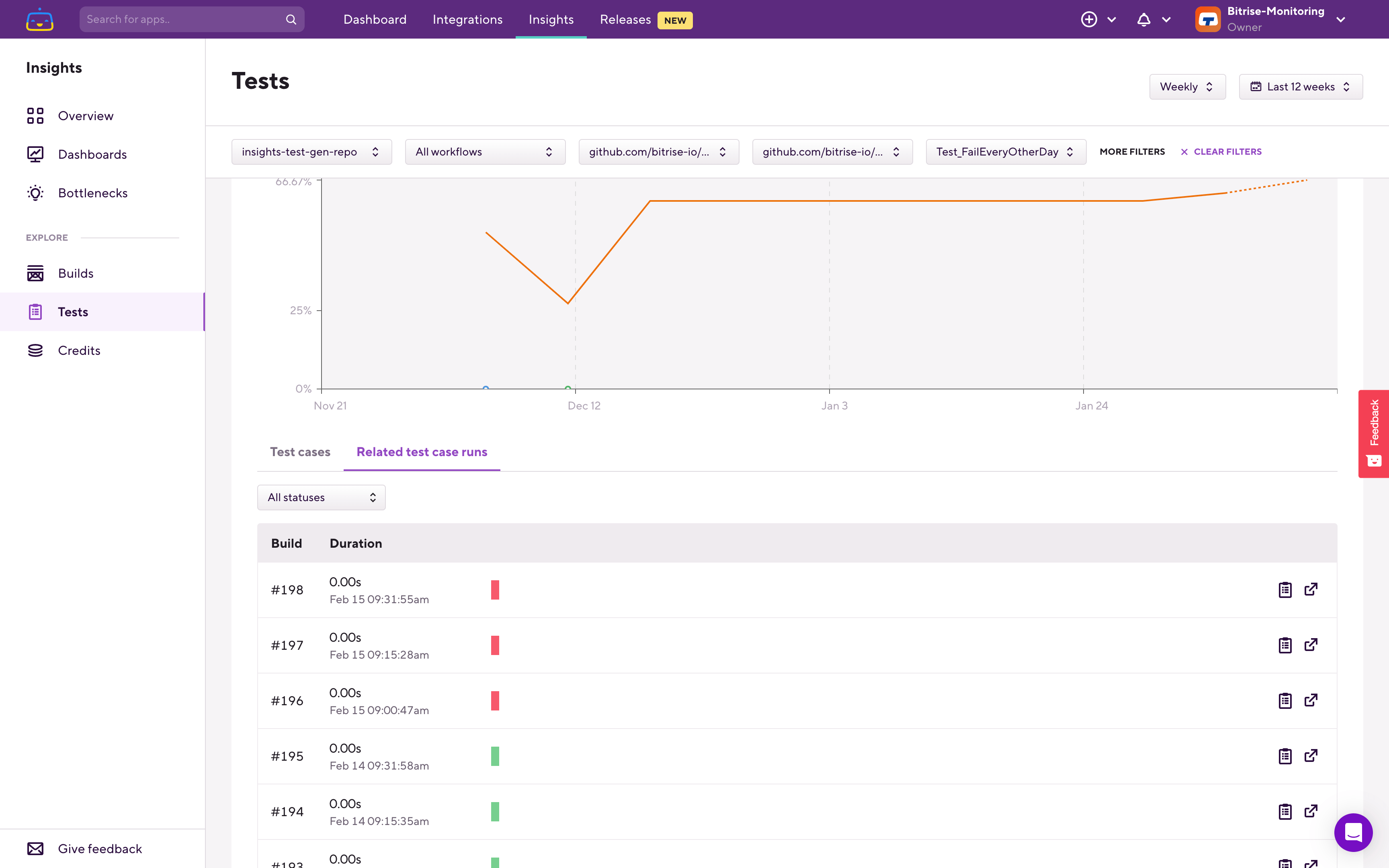
Using the Related test case runs table, you can see all the previous runs of this specific test case, how long that run was, and whether it was successful or not. Using the buttons on the right side you can quickly jump to the relevant build’s page and to the relevant test report’s page and then continue your investigation there:
Keeping an eye on and improving your test failure rate helps you to reduce wait time during the app development process and to increase the efficiency and productivity of your team.